Learn how we approached Design Thinking to solve the UI/UX design issues that we were trapped in.
The following is the process that we follow here at Codeparva. These are fluidic in nature and are followed on a case by case basis. It depends on the nature and the complexity of the feature. For large features with a large dataset and to make them intuitive to the user as well as being scalable, adhering to the order would be the correct way to get the designs done. For smaller, less complex features, combining step 2 and 3 would help in iterating faster and getting the desired user flow early on in the process. These are the following steps of the process:
- Gathering business data and generating user flows
- Rapid prototyping and ideation through quick sketches
- Generating wireframes from the final set of approved sketches
- Prototyping or designing interactions with the final set of Wireframes
- Creating High Fidelity screens
Business data consolidation
This is the beginning phase to kickstart the process. Perhaps the most important phase which helps the designer define the problem well. The designer gathers every single aspect of the business for the feature(s) he has to design. These include but are not limited to:
- Understanding all the data points that exist in the feature
- Understanding why they exist and how they impact the business
- Understanding how the data points affect the user
- Understanding the relation of those data points with other aspects of the business
- Prioritizing the data points that the User will most likely interact with
User journey and User flows
From the data gathered above, the designer can start mapping out the journey or the path a User might take to achieve his/her objective. It's also called experience mapping or user scenarios. The main objective for this step is to make sense of the data points from the User’s perspective and to design a flow that would best fit their usage. Following this we have 2 modes for information organization:
- Information Hierarchy - Here we group together the data points that are of the utmost importance to the user and would represent a constant source of interaction at the very top and as we go down towards the bottom, we group together the data points that are infrequently used
- Information Architecture - Information architecture dictates the flow of actions a User will take when interacting with the software. Below is a sample of that (copyright Pedro Aires):

(Image by Anatoly Maslennikov)
Here the flow from one touchpoint to the other is mapped leading to a clarity on how different data points are organized and can help in designing navigation and the UI. Each of the touchpoints is a screen that can be ideated in the next phase.
Sketching and Rapid Prototyping
In this phase, the goal is to generate as many ideas as possible without getting too bogged down in the details. It is to get a rough idea of layouts and to get a feel of the overall look of the product. User flows and functionalities should be tested at this stage with the help of layouts. A minimum of 10-15 variations of the layout can be presented. Those variations will undergo further iterations to refine the layout depending on requirements or user flow. Prototyping or interface design can also be tested since cost is minimal. Based on the Information Architecture and also layout designs, how subsequent screens flow and how different aspects of the screen change can also help in informing the design choices.

Image by Sergey Peterman
The final deliverables will be 1 or 2 finalized and approved sketches for both Desktop and Mobile
Wireframes
Wireframing here would be to take the final approved sketches and convert them to a cleaner, more refined version of the sketches. Here the designer can further experiment with the layout depending on typography, since that changes the layout and thereby impacting the interactive and visual design. The final deliverables will be 1 Wireframe( or multiple depending on how the screen flows from the initial one)
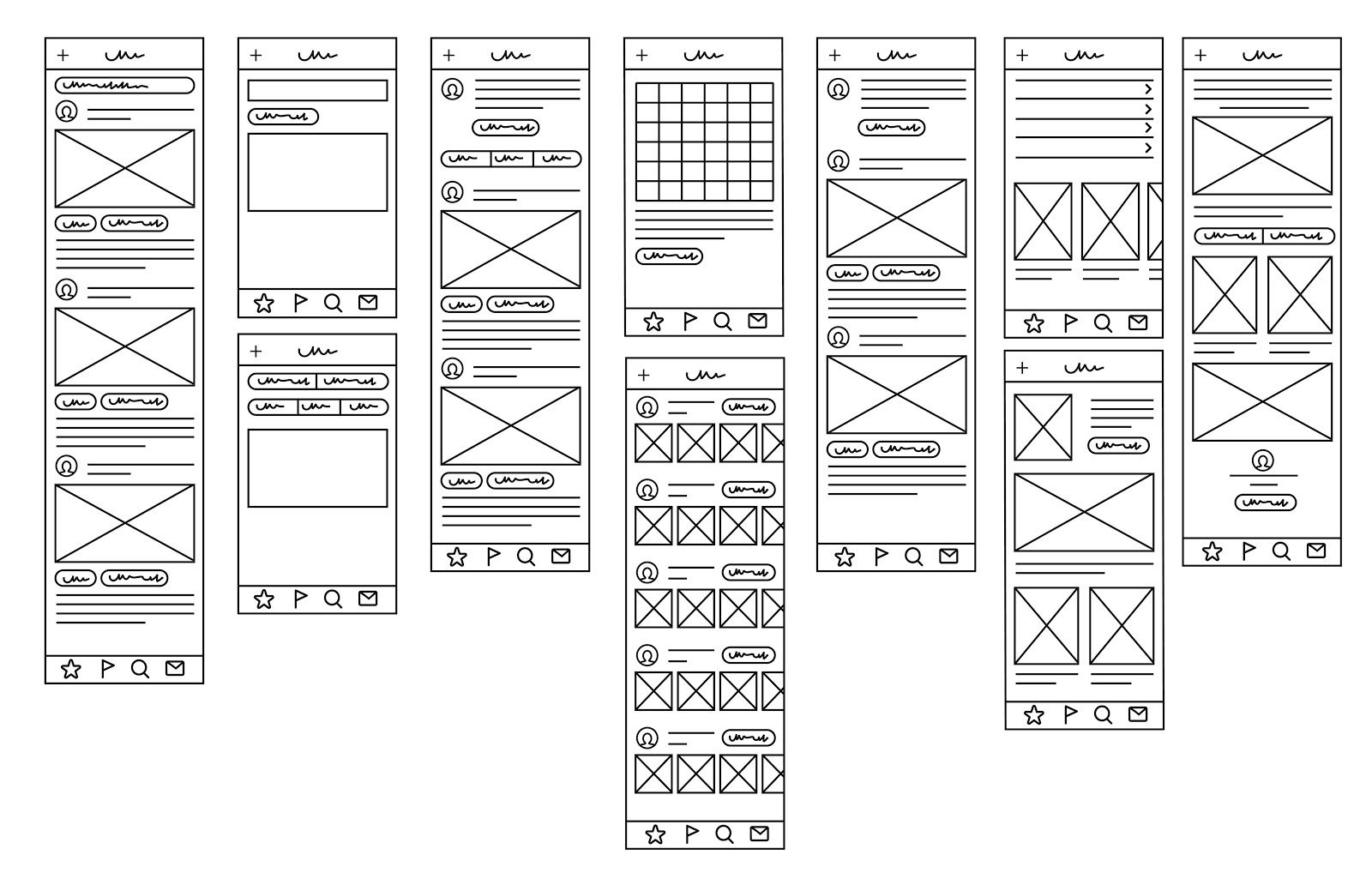
Image by 300_librarians
Prototyping(Interface design)
This step focuses on the interactions of the Wireframes. Based on the rough prototyping phase during the sketching process, the designer can convert those interaction designs with the actual wireframes that were generated in the previous phase. This phase would dictate Usability testing for the designs that were developed earlier. Any issues in this phase would then dictate the changes in the wireframe stage. It enables all the stakeholders to actually test the designs and provide feedback for further refinement.
Prototyping during the sketching phase:
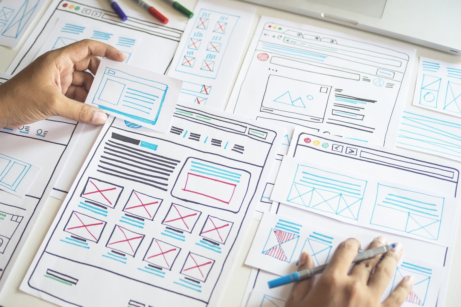
Image by Sergey Peterman
Prototyping after creating final wireframes:
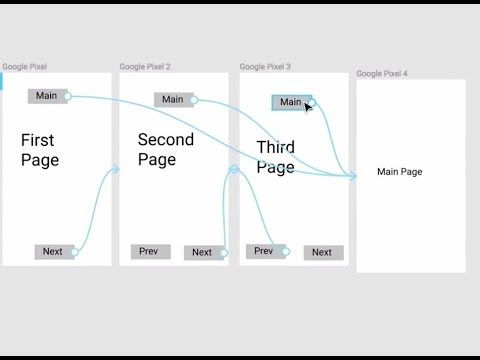
Image from Figma
The final deliverables in this phase will be Enabling Interaction for the Wireframes developed for both Desktop and Mobile.
High Fidelity Screen
The final step in the process. As the name suggests, this is where you start adding all the content and icons and start focussing on the finer details. Ideally there shouldn’t be any layout level or major redesigns at this stage. This stage should represent the final look and feel of the product. The deliverable will be the 1( or multiple, depending on interactions) Hi-Fi screen with everything locked in. This is the final screen that the end user or customer ends up seeing.
Challenges during UI and UX Process
Following are the list of issues that we as a design team had to tackle and solve. The process that we have implemented helps us in addressing the following issues:
- UI/UX Challenges in the Self storage industry
- Current understanding of the Users
- Evaluation of the current design
- Time taken from the ideation phase to a finalized phase
- Easy to understand interactions in line with User flows
- Keeping the design fresh and contemporary
UI/UX Challenges faced by our product in the Self Storage industry
Due to the fragmented nature of the industry and with a wide variety of use cases of how our customers utilize the software for their facilities, there isn't any standardized way of interacting and accessing the features that the customers use.
There is a wide variety of configurations that are customized and tailor made for each customer. Hence the main challenge faced here is to provide a visual and interactivity framework where components can be re-used and re-factored to improve scalability as well as provide a consistent design and thereby ensure a consistent experience across our varied customers.
Current understanding of the Users
Before standardizing or creating a framework, we have to understand who our Users are and how they interact with our software. The major crux of this process is to understand what is important for them and how they can quickly achieve what needs to be done.
Hence the process focuses on Data organization and Information Hierarchy, thereby dictating User flow, navigation and ultimately the User Interface. Data organization is where all the features and modules that the User needs to interact with are organized.
The key thing with this process is keeping the data that's relevant to the user. From here on, the data is then re-structured to keep in line with the flow that's most intuitive for the user. This represents Information Hierarchy and this phase decides the flow for the entire screen
Evaluation of current design
Since this is a highly fragmented market, it is important to understand how the current system and the processes in place for UI/UX impacts our product. As some standards and frameworks in this regard are already in place and since the product is not exactly made from the ground up with the new process, it's necessary to keep them in mind and maintain consistency so that every aspect of the product is coherent.
In cases where the design principles or User experience standards are not met, the existing designs can be molded to a better one while trying to maintain coherency. In cases where we cannot, then a redesign might be the solution albeit it should be taken as a last resort
Time taken from the Ideation phase to the Design phase
One of the main issues observed from point 3 is the time taken for the whole UX and UI journey. Since proper planning of User experience is not taken into account, there is a lot of iteration towards the final phase of the process. Final phase of the process should be the least iterative step of the entire process since that's when finer details are refined. Any design change here will cost valuable time for both the designer and the organization since it takes a lot of effort to make small changes. In addition to that, currently there are instances of design change after dev handoff which is even more costly.
Hence to minimize the extent of late process changes, the process aims to get most of iteration towards the earlier phase, where rapid prototyping enables to get as many designs as possible and locking onto one after approvals and then refining the finer aspects of it.
Once the initial sketches and quick user flows are locked, then there is a step called Wireframing where the designer makes a cleaner, refined version of the sketch without going to finer details like color, icons, typography. Here it's easier to read the design as opposed to sketch, especially for stakeholders who may or may not come from a design background. Once the Wireframes are approved, we go to the next time as detailed below
Easy to understand interactions in line with User flows
Before moving to the final phase, there is one step which decides how the users will interact in the final product. This is called the Interaction design. It derives its roots from Information Hierarchy and User flows. This is done after the Wireframing stage and the reason it's done in this stage is to see if the quick user flow and rapid prototyping that was done earlier holds up with the locked Wireframe.
This is done again so that the stakeholders will have a clearer picture on how the product flows and gives a glimpse on how it works. If some issues arise from this phase, it's easier to go back to the Wireframing stage and tweak the design and the interactions so that it works as the User intends it to.
Keeping the design fresh and contemporary
The aesthetic or the UI part of the user experience is just as important as the user journey map that has been charted above. The issue currently is that the designs for the products in the self storage market is uninspiring.
By giving the product a modern and clean look, inspired by many trending and upcoming designs, it drives user engagement with our product and helps us maintain a USP which sets us apart from other competitors. The look is what the Users will remember and will want to continually engage with. No one wants to look at a boring screen no matter how well laid out it is.
Conclusion
This process has helped in organizing the information and requirements into a coherent design as much as possible. Due to the dynamic nature of the industry, there will always be iterations and there will be changes to the process to better suit the time constraints and user feedback. But having this established structure can help in achieving and realizing the goal and vision of the organization while ensuring minimal corrections as and when needed.
If you like the idea and want to know more, doesn’t matter if it is the industry or the product, you can always connect with us. Visit Codeparva Technologies to know more about us.

